Tech

Making of Icarus

Making of Icarus

Inspiration for a photo or art work can arrive at any moment. This was the case with the above art work Icarus. Originally I was looking out of my window and wanted to take a shot of the setting sun will the horizon line close to the bottom of the frame.

Read More

Curiouser and curiouser!

Curiouser and curiouser!

During a recent shoot with Miss Morphic, we set up a shot to simulate Ana falling while wearing an Alice in Wonderland costume. I thought sitting on the Box of White Doom while having her rest her foot on the White Chair of Unspeakable Horror would be preferable than actively pushing Ana down a rabbit hole. The studio was lacking in rabbit holes to begin with.

Read More

Flaming hot...

Flaming hot...

It is now June 2017 and the Earth is now tilted towards the Sun so everything is getting hotter. With that in mind I decided to edit one of the shots from recent shoot with Briar Rouge. I took inspiration from her red hat, with the intention of creating a much warmer photo.

Read More

Gotta catch them all

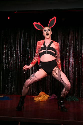
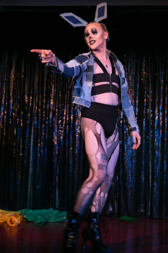
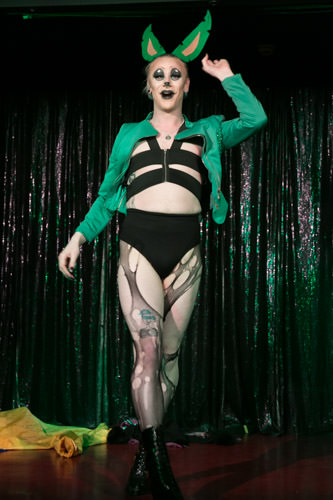
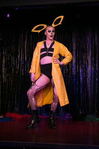
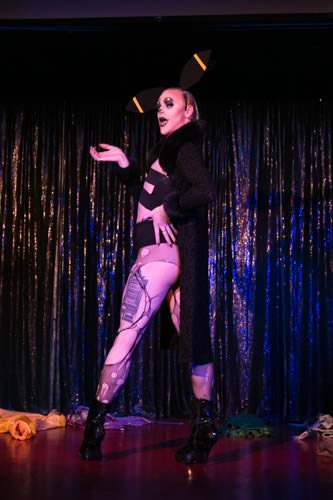
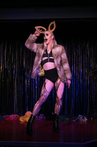
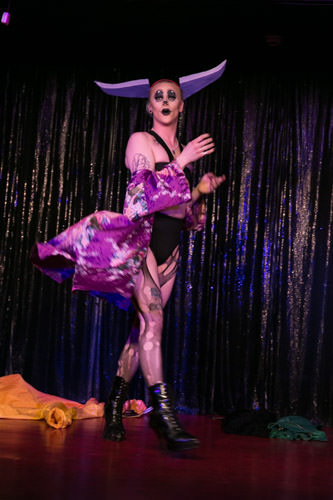
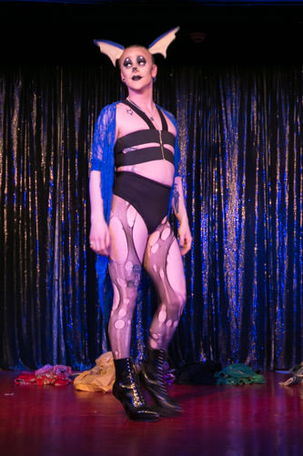
While attending the Royal Vauxhall Tavern to shoot the live performances of Cabaret Roulette - Evolution, I fired off a number of shots of a performer called Ruby Wednesday.

Her take on Evolution was of a Pokémon character Eevee who would evolve from one state to another with lip-synced music for each one. It was a great performance and I immediately thought this would make a great composition piece to work on later.

Below are the eight pictures I choose from the set that I thought would work well. I looked for expression and the stance of each to work out the composition. I wanted them to be close together to create the illusion they were all on stage at the same time.

All the shots were loaded into Photoshop as layers. The canvas was extended to create a large wide screen format. Each layers opacity was reduced to 50% so I could where arms and legs would overlap. Once in place the opacity was raised again and the task of masking each one together began. At this point I switch on my music play list and just get on with it. After an hour of brushing, cloning, swearing and two cups of tea I had my result below.

The resolution of the photo was around 13k on the long side but was perfect for a Facebook banner ratio once I added the bars at the top and bottom.

I like doing compositions of live acts, they are a challenge.

JME

Hazy Autumn

Original - Click/Tap to enlarge

Once in a while I go back to older photos and apply newly learned techniques. It is a great way to see how far you have come.

I tend to go through the old photos and think 'What was I thinking??' at the time, I was probably thinking how great it looked.

With the photo to the right, taken at Morden Hall Park in Merton. The bridge you can see is very old and probably dates from when the park was constructed. Morden Hall itself was built around 1770's.

At first glance, I still like how the original looks. But.. it lacked something. Colour for one thing! OK green is nice and the white behind the bridge looks good but to my eyes now it looks flat and bland. Also I wanted the bridge to stand out. From memory this was taken with probably my Canon 18-55 lens which wouldn't have had the depth of field I wanted in this shot.

So I threw the shot into Photoshop and attempted to create a mask to blur out the back portion of the shot, behind the bridge but keep the trees to the left and right of the bridge on the same plane. This was fiddly.. and take a long time. Fortunately I knew that some of the extra work I was planning would mask some of the fiddly bits as I was going for a 'painterly' look. Once the mask was completed, I then used Gaussian Blur to soften the back ground part. If this was done to much then it looked odd and out of place.

The shadows had to be pushed up a little on the left hand side to balance the composition. I used a colour mask to change a lot of the leaves to red and yellow to reduce the large amount of green in the shot. The whites were pumped up to add more light to the background. Finally a layer was added with a white ball to the left hand upper corner, blurred heavily and opacity brought down to around to 20% to create a haze of light.

Hazy Autumn - Click/Tap to enlarge

I am often asked 'Which is you favourite photo?', this is one of the closest one so far.

Adding Fuel to the fire...

OK the odds of this happening are very small but I wonder if anyone in 7th century China, after watching a firework explode over head, had any idea that centuries later I would be photographing a performer call Red Sarah on stage at the Royal Vauxhall Tavern in London? Probably not.

Read More

Undressed vampires

I am challenging myself to pick a shot from each shoot I do and create a more advanced edit that I would normally do. This will keep my Photoshop skills up and I can learn new techniques as I work.

On the 12th of June I was asked to shoot for the House of Burlesque at the Electric Carousel in Piccadilly. It was a standard shoot of the show with a few shots of the stage and audience thrown in. Images were sorted, edited and delivered the next day. I then looked for which of the shots I would like to edit beyond the standard.

I choose a shot of performer Trixie Kixx. There were a number of things that I wanted to change from the original. I was going for a ‘vampire’ type vibe as an end result. This was taken with my 70d and the Sigma 70-200mm f2.8.

  • The red curtain needed to be removed in favor of the better right hand side of the frame.
  • Skin needed to be smoother and somewhat waxier.
  • Remove distractions.
  • Reduce the overall redness.
  • The lighter and darker parts of the clothing needed to be enhanced.

If the above worked I should be looking at something that may have been shot in a crypt rather than on a stage.

One of the first thing I did was to clean up the image, using the spot healing tool in Photoshop CC 2015 to remove scrapes, blemishes and other pieces that I knew would be trouble and stand out later. On the inside of the coat there looked to be stains of some sort. These turned out to be flower patterns woven into the fabric. I didn't think flowers were very 'vampish' so these were removed.

The next stage was to tidy up the curtain on the left hand side. I used a shot a couple of seconds after this one where there was more of the right hand side showing. I add this as another layer and used a mask to remove the parts of the shot I didn't need. The mask followed the line of Trixie's arm and right leg.

I then decided it would be a good idea.to blend the two layers together to make a background layer and then create a mask of Trixie herself to aid in edits further on. I darkened the Background layer a little to reduce the red glow.

I made a copy of the Trixie layer and used a slight Gaussian effect to blur the skin. Again a mask was used and brushed back the clothing and necklace. This smoothed out the skin and allowed me to also add a brightness layer to brighten the skin and make it stand out from the background.


A Trixie layer was exported back to Lightroom and opened in Topaz Glow. I had an idea to enhance the clothing and necklace. Choosing a preset and saved back to Lightroom, opened back into Photoshop and copied to the main project.

The whole of that layer was effected by the Topaz Glow effect so I added a mask and brought back only the areas of the clothing that I required. However this had the effect of making the highlights look like diamonds. It was a nice effect but not what I needed here. So I used and Curves adjustment layer and reversed the effect.

This had the effect of darkening and reddening the detail which fitted the vampish effect I wanted. I darkened the rest of the clothing to make it darker than it's original color.

The final TIFF was saved with ZIP compression to layers so the overall size was around 600mb rather than 1.4gig.

Final adjustments were made in Lightroom were used to sharpen the red highlights of the clothing and headpiece. With slight darkening around the edges of the arms and legs just to blend Trixie in a bit better with the background.

Adjustment brushes were used to lighten and De-saturate the skin where needed. I didn't want the skin to look to undead like but not quite 'alive' if you know what I mean.

Finally I used a custom preset to darken and add a slight blue tint to the background. This needed removing from Trixie again so back went both the darken and normal images as layers to photoshop and the the dark parts removed.


The final image is below along with the original for comparison.

Before and After... no vampires were harmed in the making of this image.

Trixie Kixx is a Neo burlesque artiste with all the curves and all the moves!

Follow Tixie on Twitter at https://twitter.com/trixiekixx/, Facebook and Instagram.

Thanks to Trixie for allow me to feature her performance in this blog post.